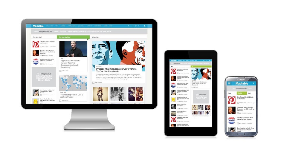
Responsive designs with mobile optimization is a necessary factor to look into in the present days as most of the users have mobile access and the sites are also mobile friendly. Mobile Responsive sites get more ROI and you cannot ignore this fact while designing your site.
Two elements you need to harp upon while concentrating on mobile experience: Why mobile users visit your site? And what do they want from you?
Use these 5 metrics and understand your mobile visitors better for a good ROI.
1. Image scaling and its value
A desktop image may look a disturbing part on a mobile. Suppose an image that looks wonderful on a desktop may swallow up the entire screen on a mobile and it may not be an effective visual that draws good user experience. Think on How to optimize Mobile Website and work on it accordingly.

2. Simplifying navigation
Mobile visitors expect easy navigation with a visible and easily accessible menu. Once the navigation bar is clear and quickly functional, the users get what they want without wasting time. Using mobile for clicking to their desired pages is after all to save time and get a quick user experience.
Your visitors may need to visit the ‘search bar’ instead of ‘call to action’ and the same way they may be interested to click contact page to reach unto the company at once.Analysing what your user needs on your site helps you customize your mobile experience .

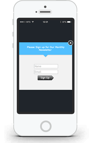
3. Remove desktop overlays and pop ups
Desktop solutions for mobile experience reduces your conversions. Desktop overlays and pop ups are not meant for mobile devices with their multifarious combinations of resolutions and screen sizes .They make navigation tough and complicated. Consider mobile technical aspects and the user behavior and do the needful. A Mobile SEO can help you optimize mobile experience on your site.
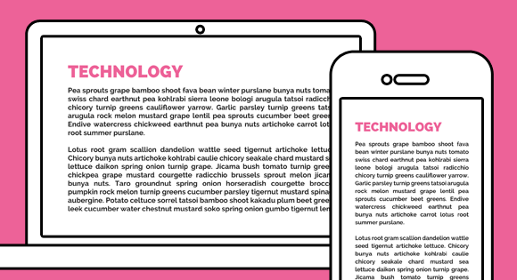
4. Shortened, simplified text
Shortened text with headlines and tag lines of a minimum number of words brings a rich experience to your site. It is good to avoid long and wordy visuals as well. On a mobile, the text should not cover the entire page so as to block the vision of the user. He may not be able to read and note the important symbols like call to action button and your conversion rates will surely go down.
5. Clear call to action buttons
Your call to action buttons should reflect the intent of your site and thus should pull your viewers to the purpose of the site at the very outset. Redefine these buttons and make sure they work well in your favor.

So, optimizing mobile experience based on these metrics is a good job to start with and hope you will follow it up for better results in future.